By Andreas Krause, Nicola Rennie, and Brian Tarran
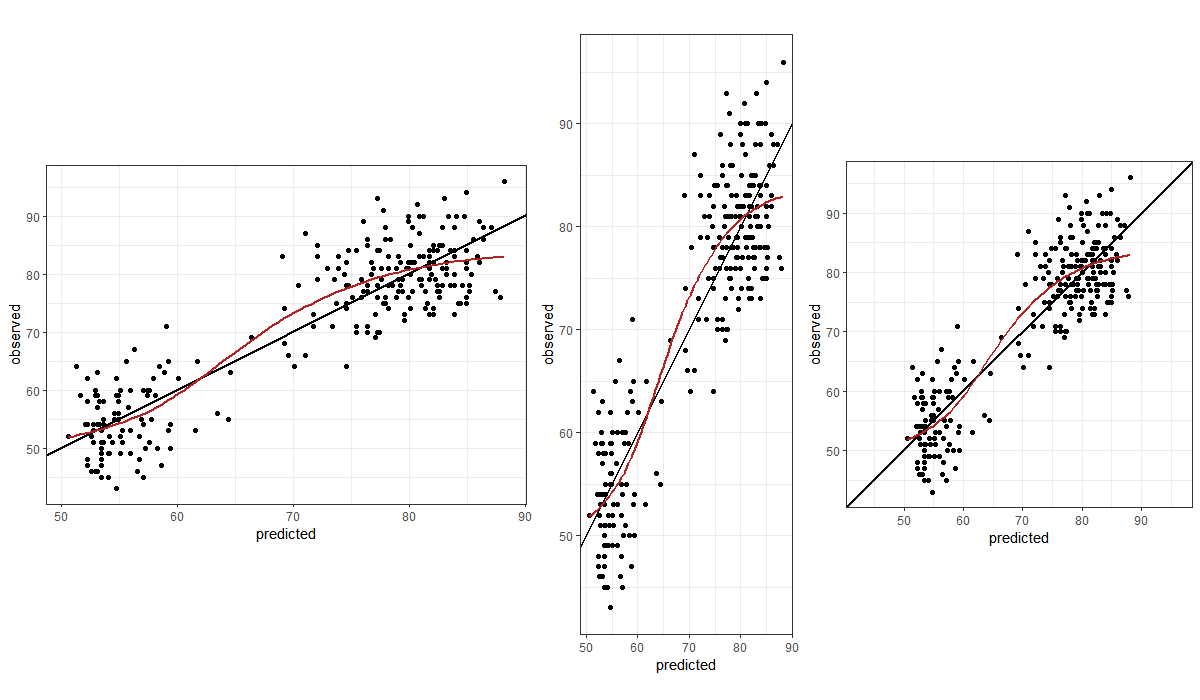
This comprehensive guide by the Royal Statistical Society offers insights and advice on creating effective data visualisations. It covers both the art and science of data presentation, aiming to make data outputs more readable, accessible, and impactful. The guide includes principles of visualisation, choosing appropriate chart types, styling for accessibility, and tailoring visuals for RSS publications. It also provides references and resources for further learning.
- Link to guide: https://royal-statistical-society.github.io/datavisguide/
