By David Keyes
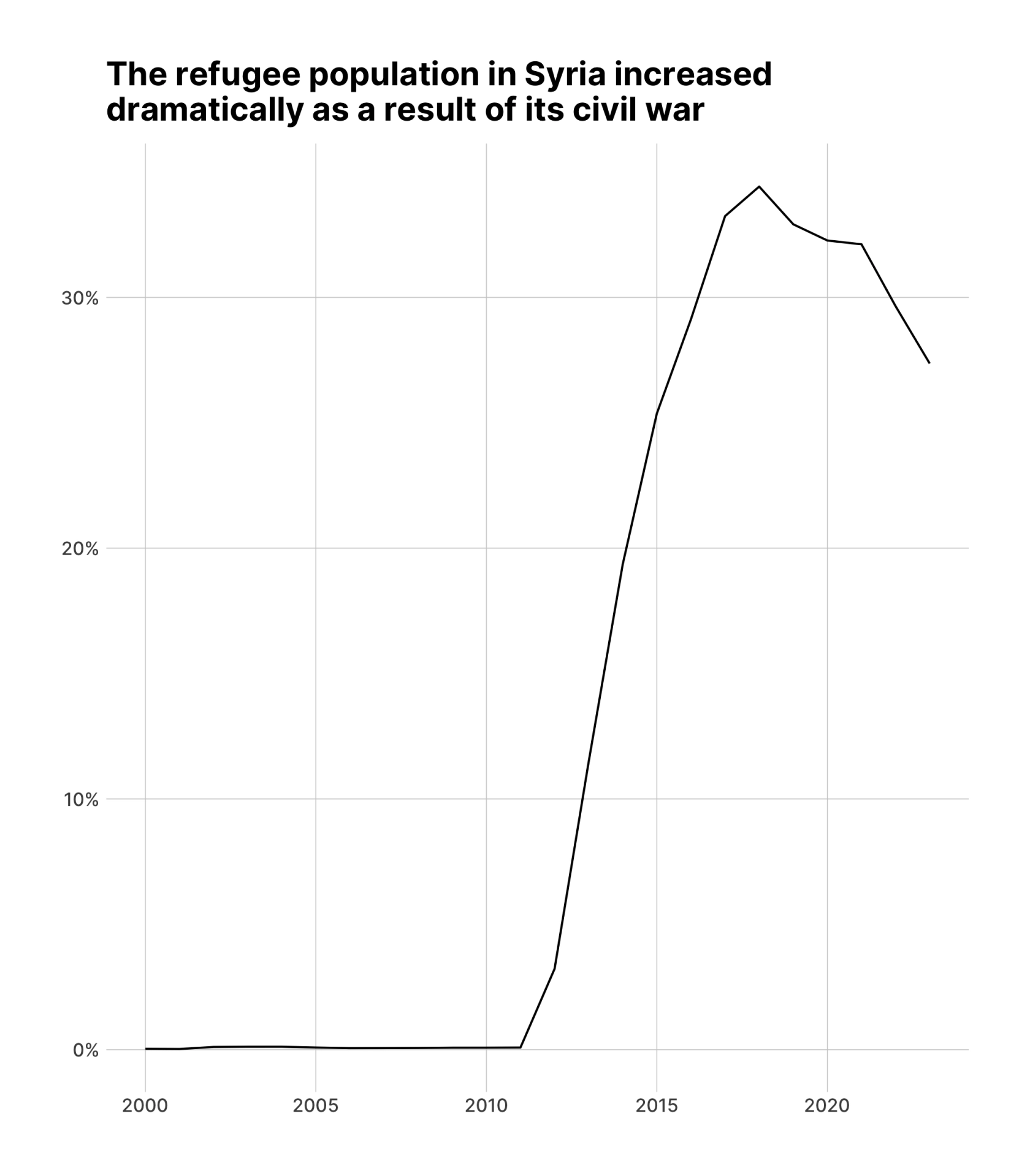
This tutorial introduces the {gganimate} package, which enables the creation of animated plots in R. Using data from the UNHCR’s {refugees} package, it demonstrates how to animate a line chart showing the percentage of refugees in Syria over time. The tutorial also covers creating an animated map of refugee populations in Western Asia, utilizing geospatial data and the {sf} package. Key functions highlighted include transition_reveal() for line animations and transition_manual() for map animations.
- Link to tutorial: https://rfortherestofus.com/2024/11/gganimate-intro