Create stylish tables in R using formattables

Author

Dr. Joscelin Rocha-Hidalgo

Published

April 22, 2018

Buy me a coffeeBuy me a coffee


By Laura Ellis

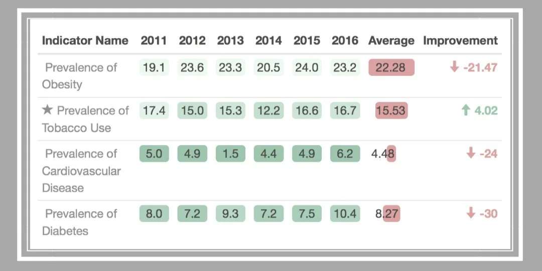
Blog that uses formattable to create pretty tables.

  1. Link to blog here: https://www.littlemissdata.com/blog/prettytables
  2. Link to repo here: https://github.com/lgellis/MiscTutorial/tree/master/Austin

Table showing health indicators from 2011 to 2016 with averages and improvement values. Rows include: Prevalence of Obesity (average 22.28, ↓21.47), Tobacco Use (average 15.53, ↑4.02), Cardiovascular Disease (average 4.48, ↓24), and Diabetes (average 8.27, ↓30). Values are color-coded with green for yearly data, red for high averages, and arrows indicating positive or negative trends.

Back to top